Challenge
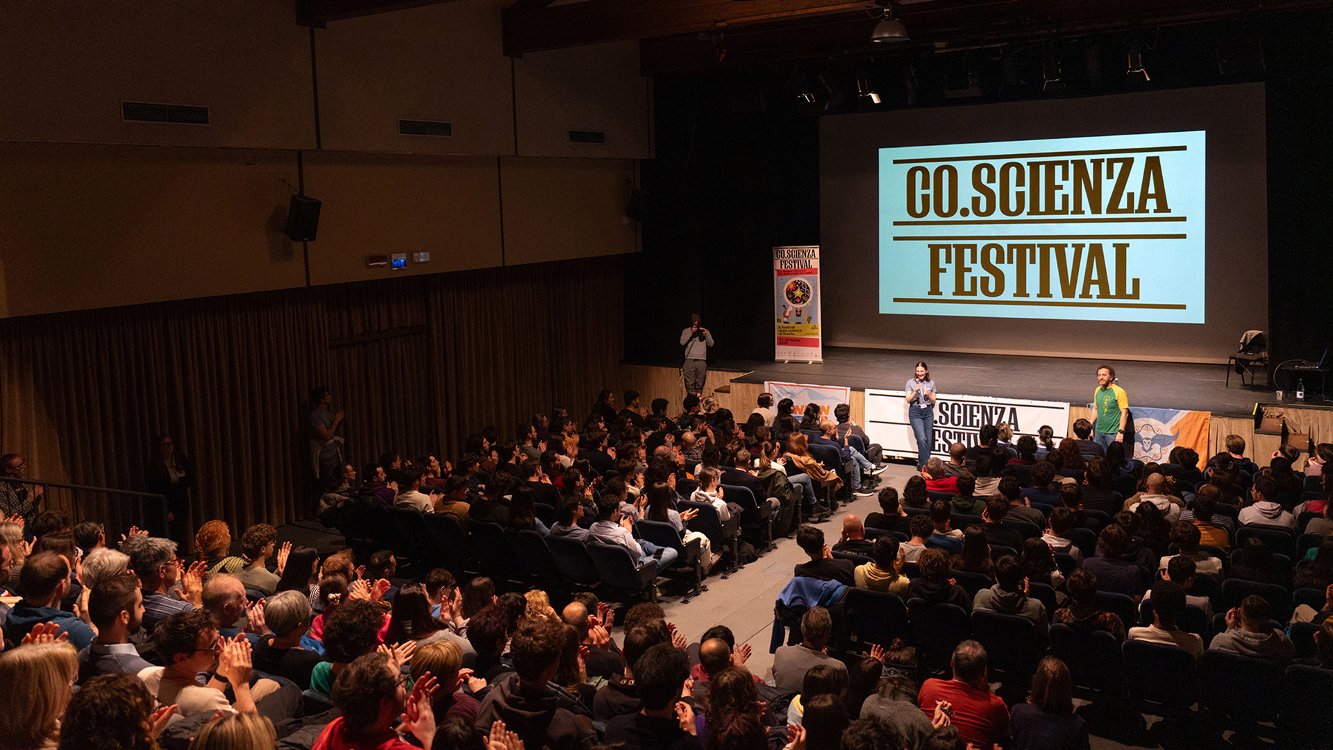
Co.Scienza Festival is an annual event in Trento dedicated to science communication, organized by Co.Scienza — a project born to foster scientific awareness and to connect citizens and students with the world of science and research through debates, workshops, and conferences. While the festival had built a reputation for engaging content and enthusiastic participation, it lacked a clear and cohesive visual identity. To elevate its presence and ensure long-term recognizability, we were brought in to develop a strong, coherent image system capable of supporting and promoting the festival consistently across editions.
Strategy
The objective was to balance consistency with flexibility — to create a visual identity that could endure over time while remaining fresh and adaptable year after year. The strategy centered on a graphic system composed of stable components that build brand recognition and continuity, paired with variable elements designed to reflect the evolving character of each edition. This dynamic structure captures the ever-changing nature of science and its themes, ensuring the festival remains visually engaging while grounded in a recognizable identity.
Solution
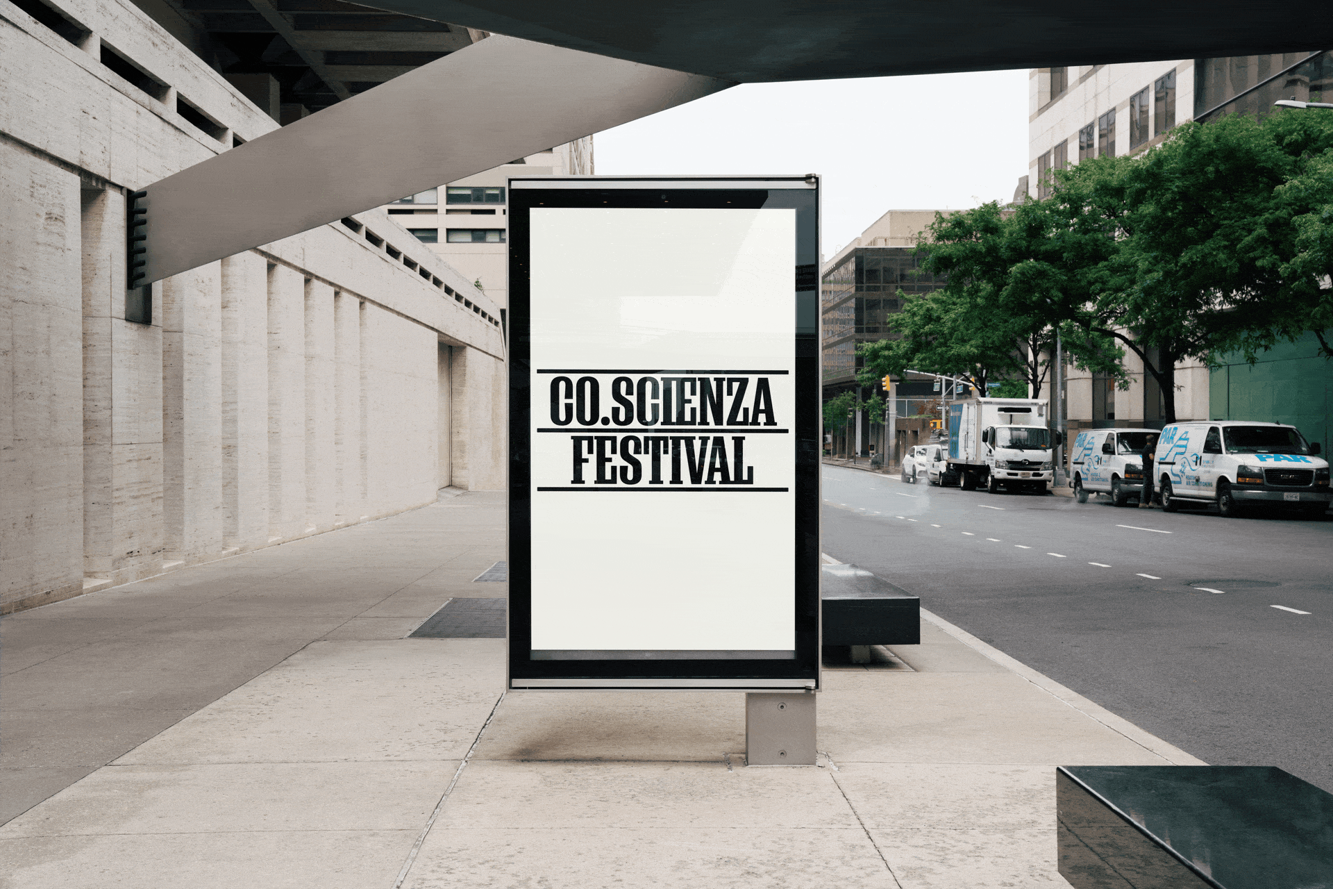
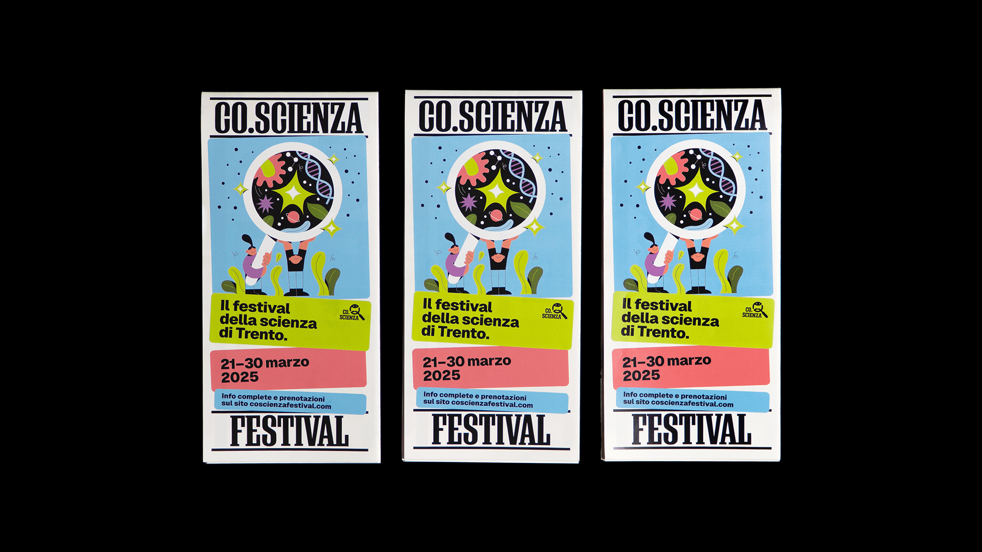
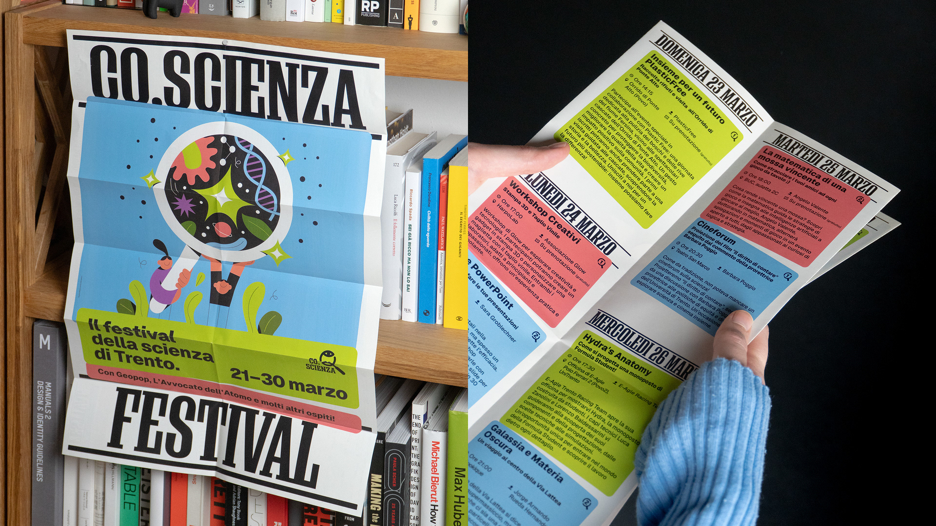
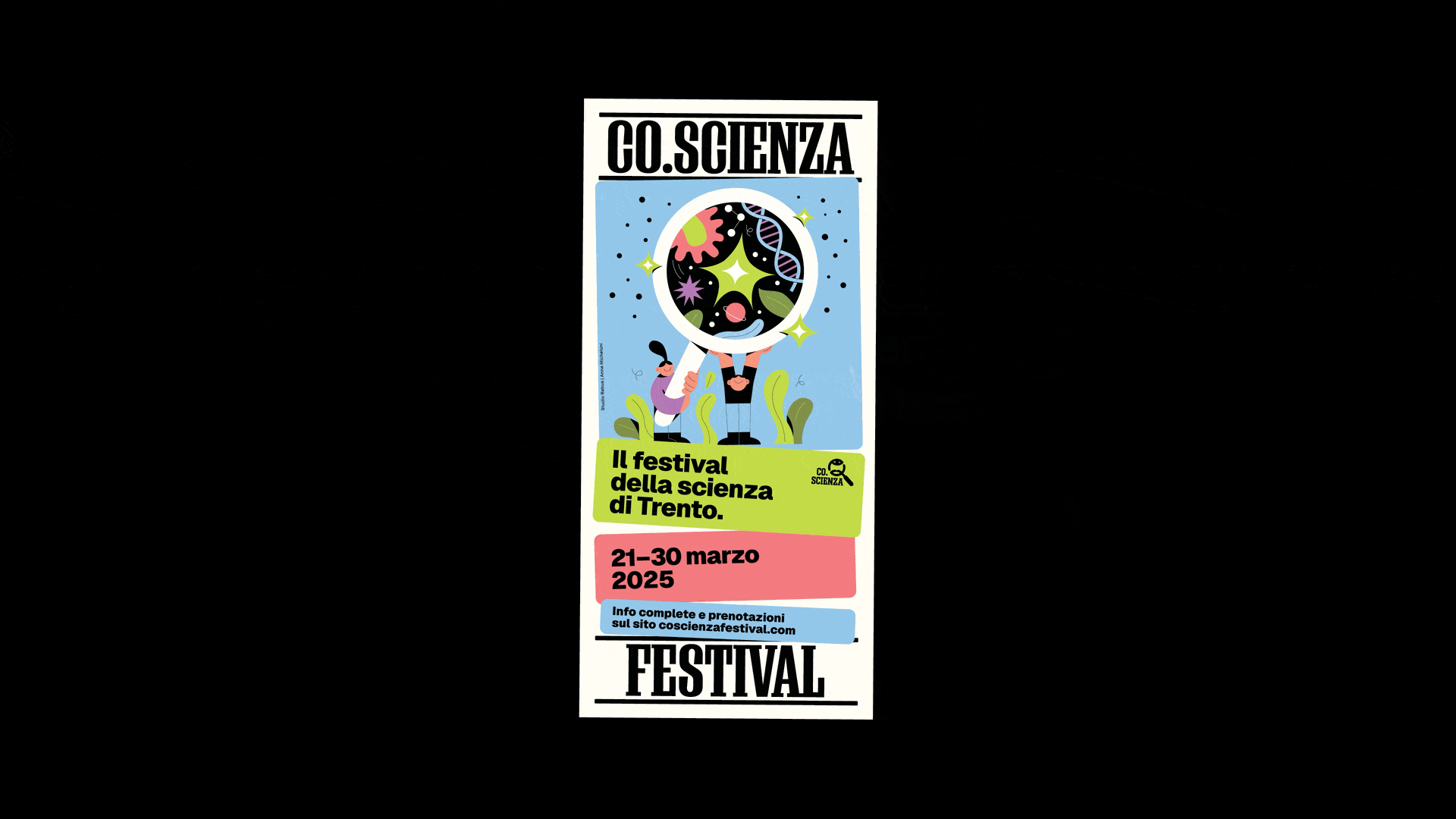
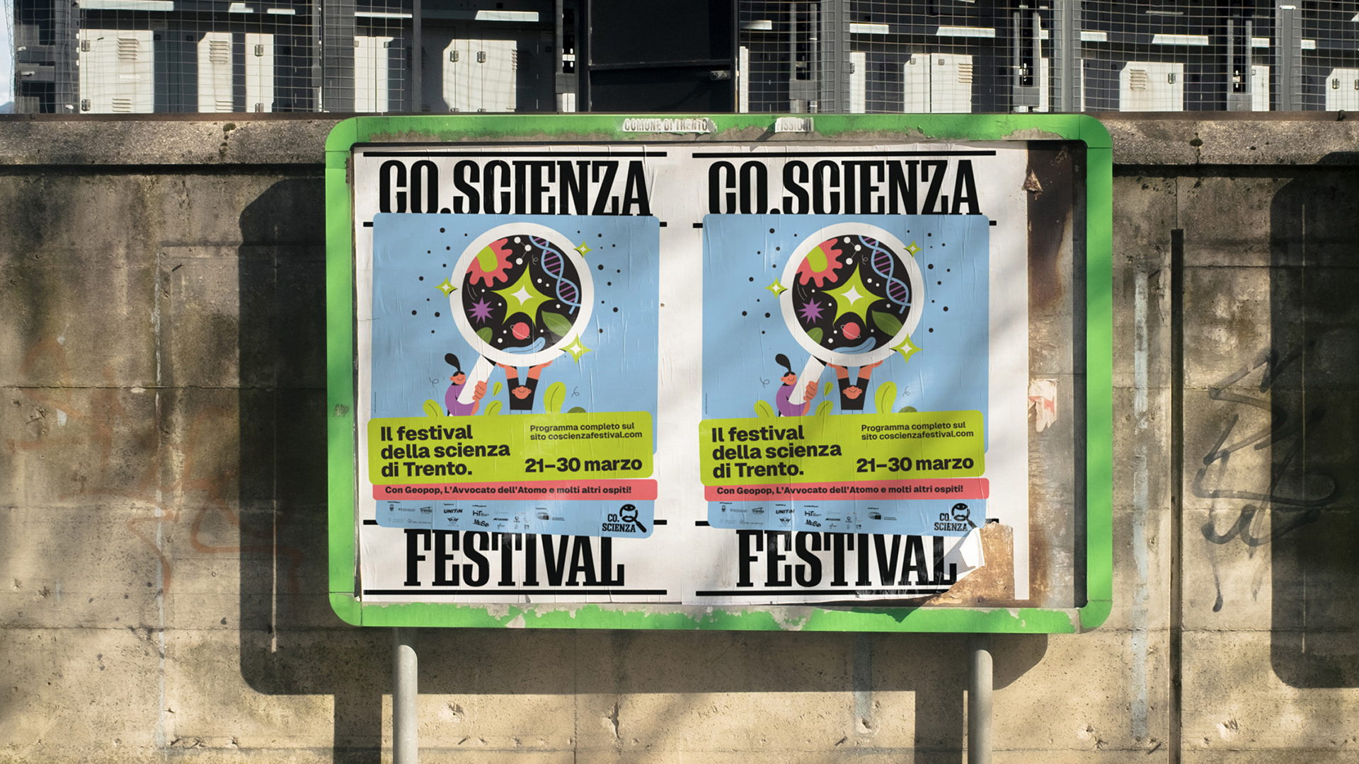
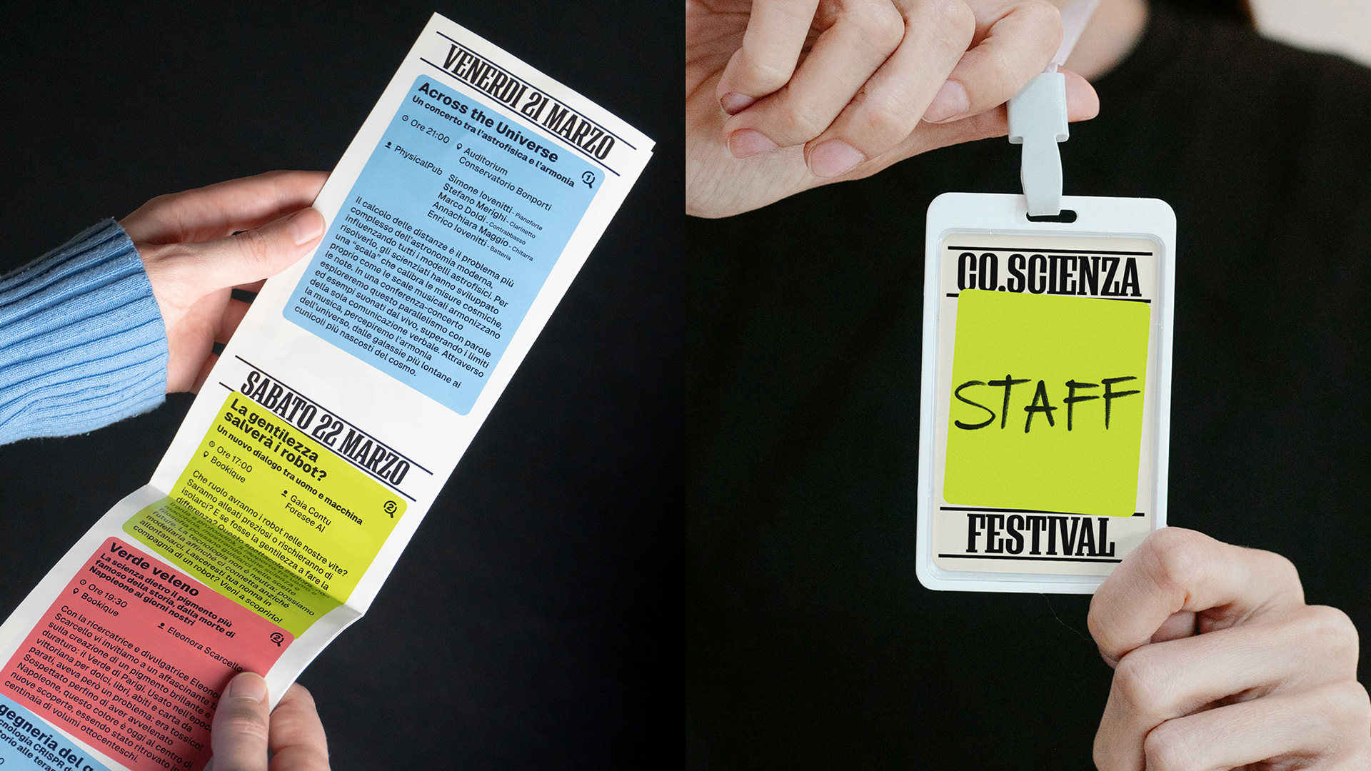
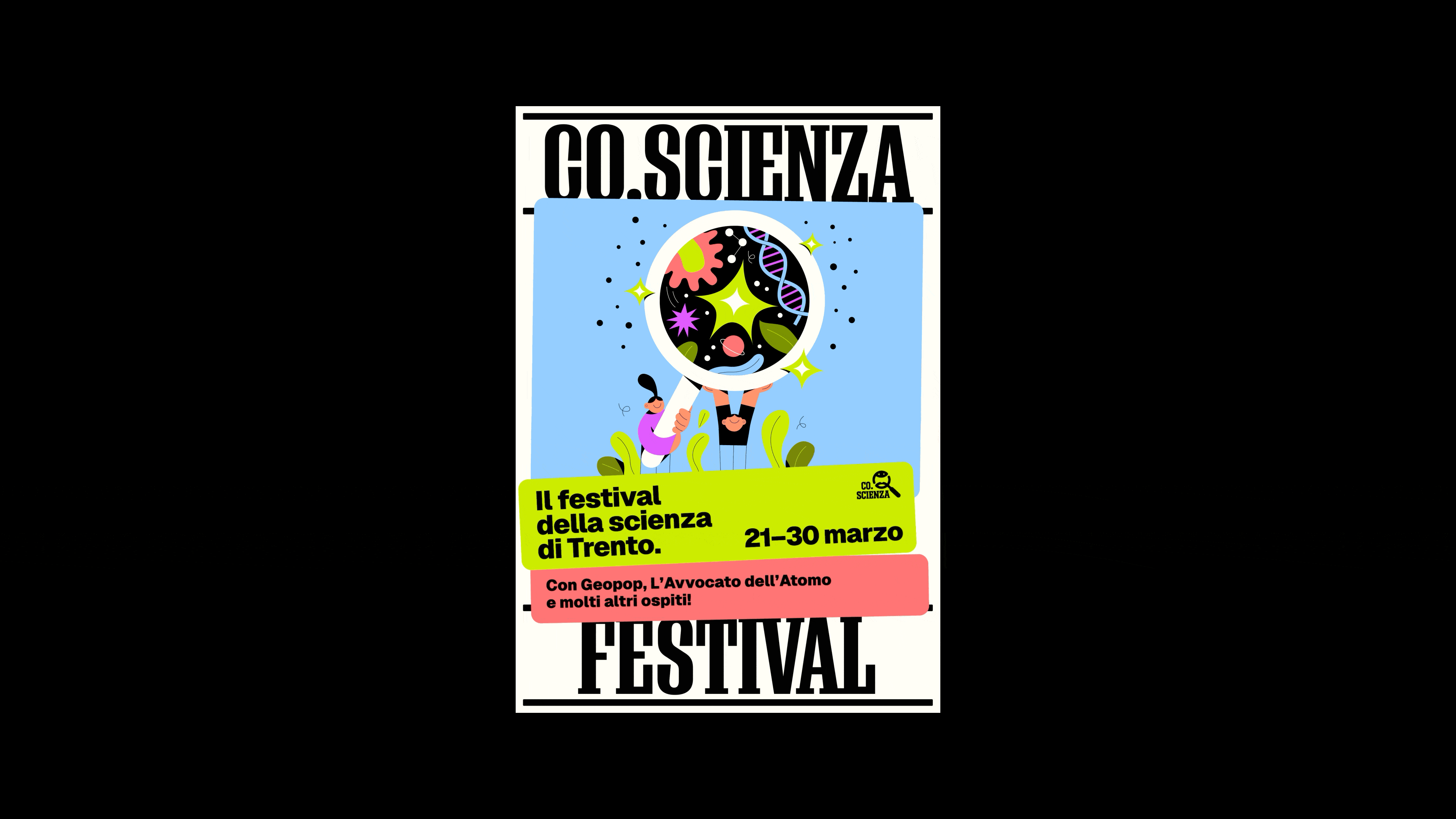
We developed a visual system anchored by two defining stripes that frame each layout, providing an instantly recognizable signature for the festival. Within this frame, vibrant, overlapping boxes bring structure and emphasis to key content, creating a lively and accessible design language. Each year, the core elements are refreshed through a new color palette and an original illustration. For this edition, illustrator Anna Micheloni brought her unique vision to the festival’s visual storytelling. The result is a brand identity that is both stable and dynamic — a perfect reflection of science itself.